
PRINTERY REBRAND
A Barbadian commercial printer seeking a refreshed, unified brand to mark a new era following its 50th anniversary and a major acquisition.

Logo design
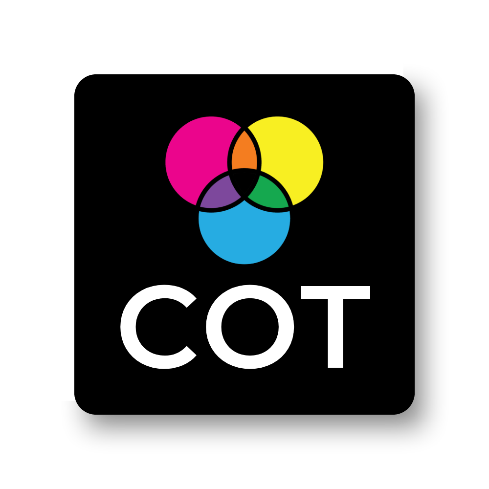
It's not always about reinventing the wheel. Ushering in a new era at COT encouraged the brand to pay homage to the past while modernizing for the future.
The 3-circle Venn was inspired by a similar logo COT had in the 80s. Through modern typeface, thinner lines, and full CMYK+OGV colours, a polished and refreshed brand was presented.
Rebranded Stationery
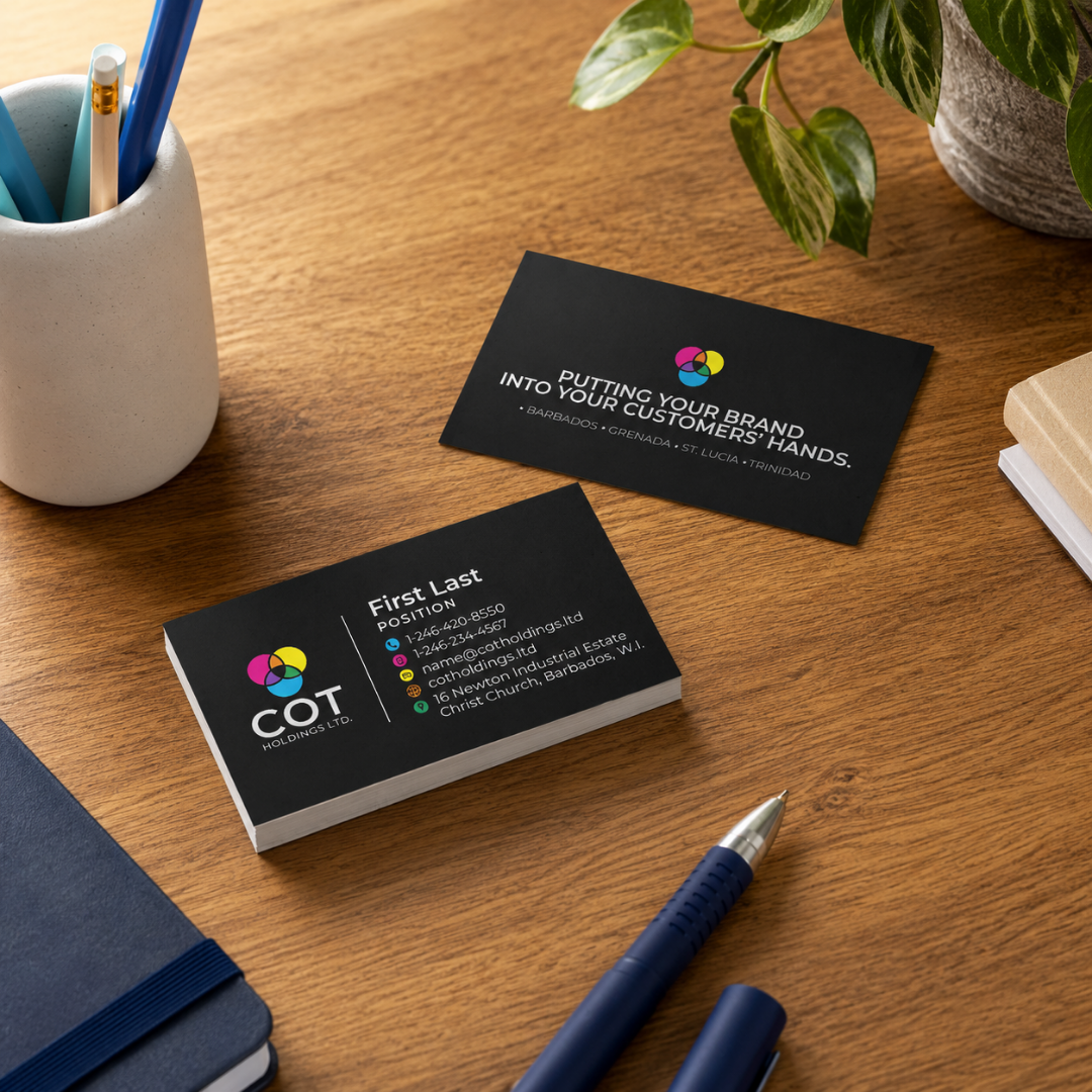
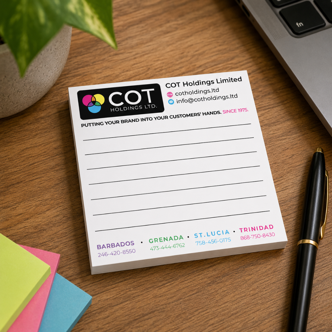
Rebranded all corporate stationery including business cards, letterheads, notepads, envelopes, deskpads, shipping materials and packaging, and much more.
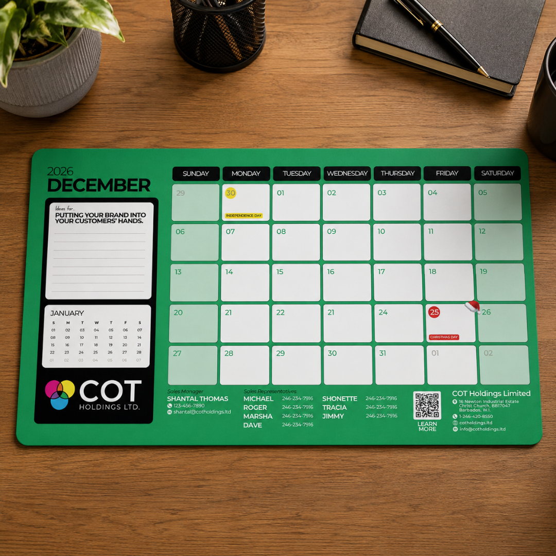
Digital rebrand
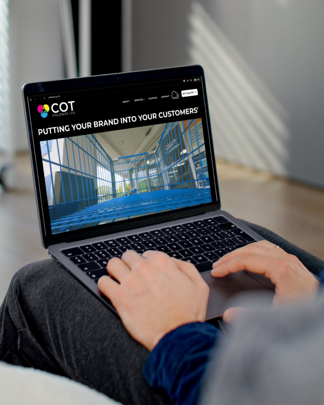
Full website rebrand complete with new hero video, product photography, and SEO/GEO structured content across 4 regional territories.
Website
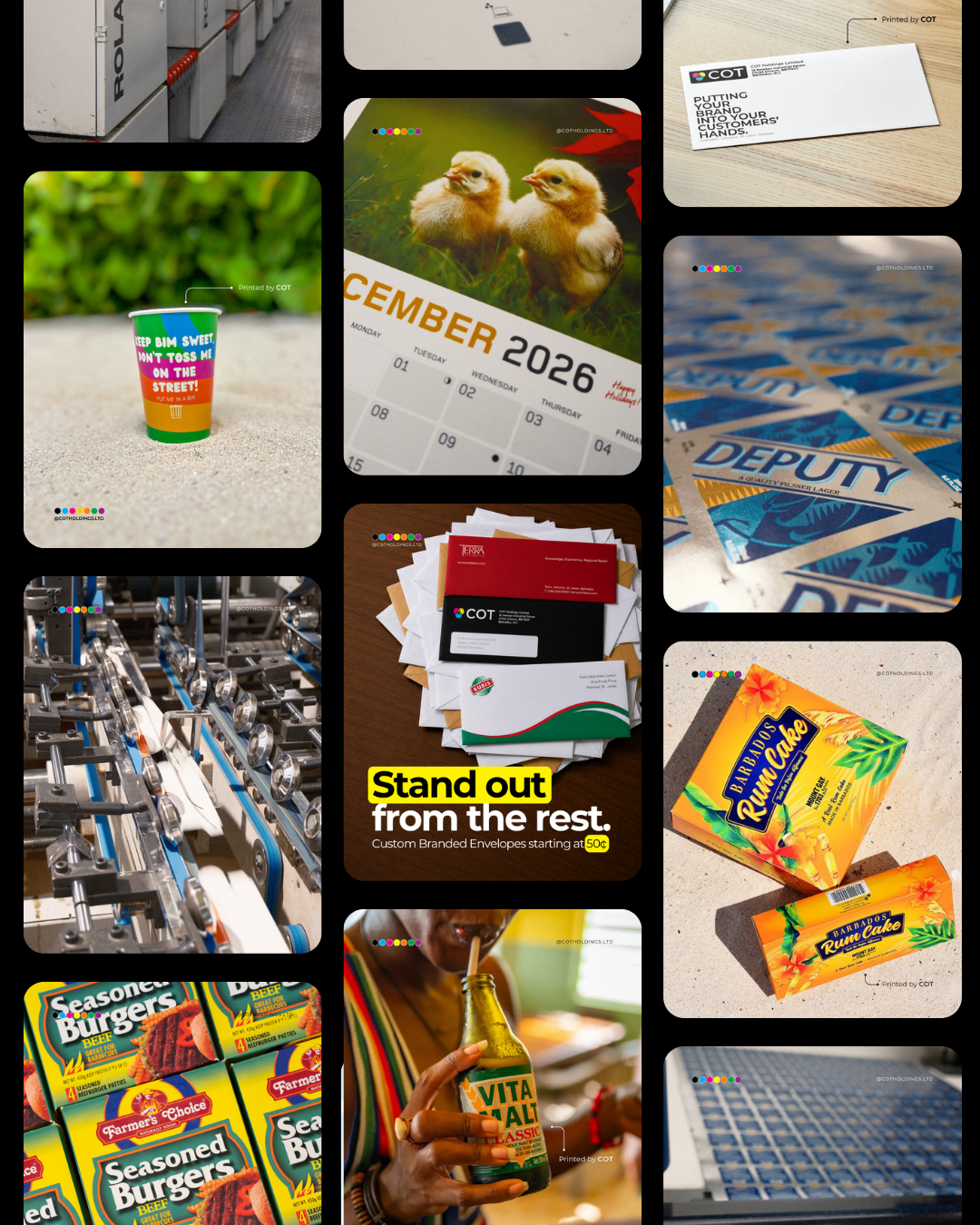
Full social media rebrand across Instagram, Facebook, and LinkedIn with inclusive of content creation and procurement.
Social media
Physical rebrand
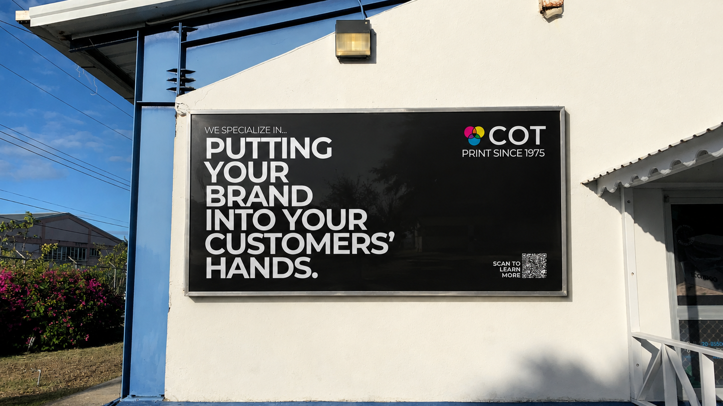
Physical rebrand at all office locations in Barbados, Grenada, St. Lucia, and Trinidad. Showcasing new brand logo and new brand slogan.
Physical signage
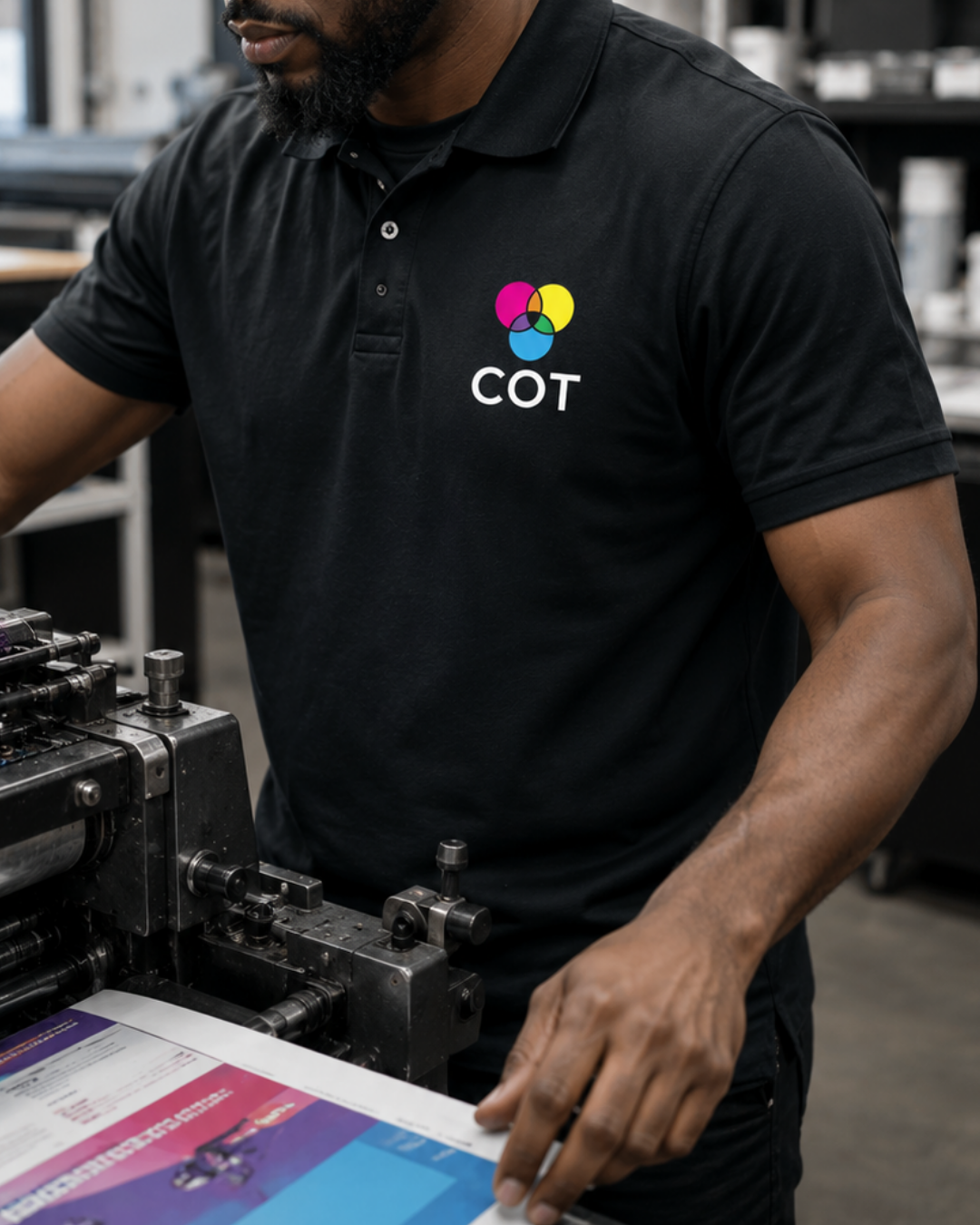
Designed and procured apparel with new logo.